GCA Website
A new site for an architecture practice repositioned for small developers, built on its own design system.
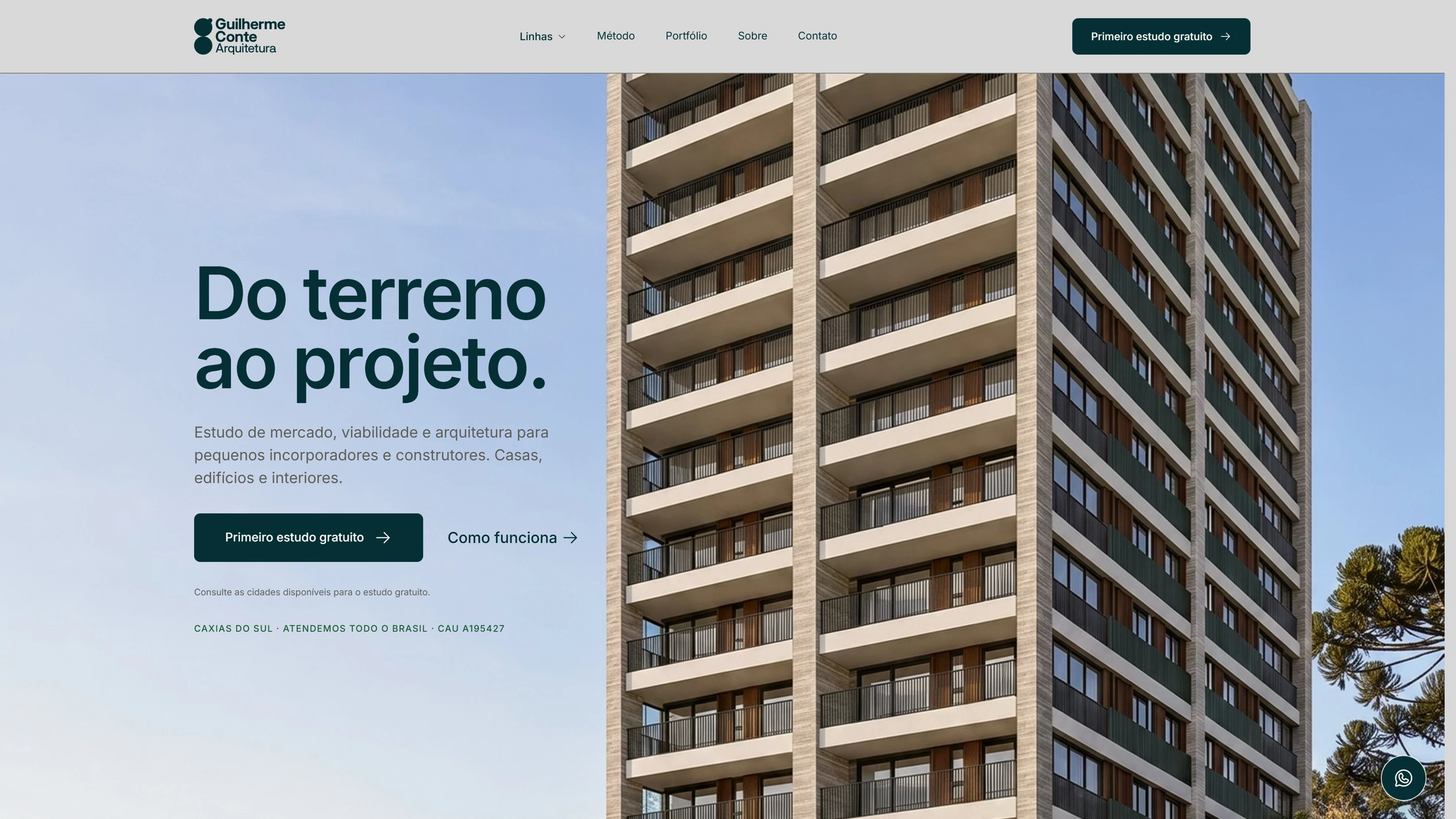

One practice, three lines of work.
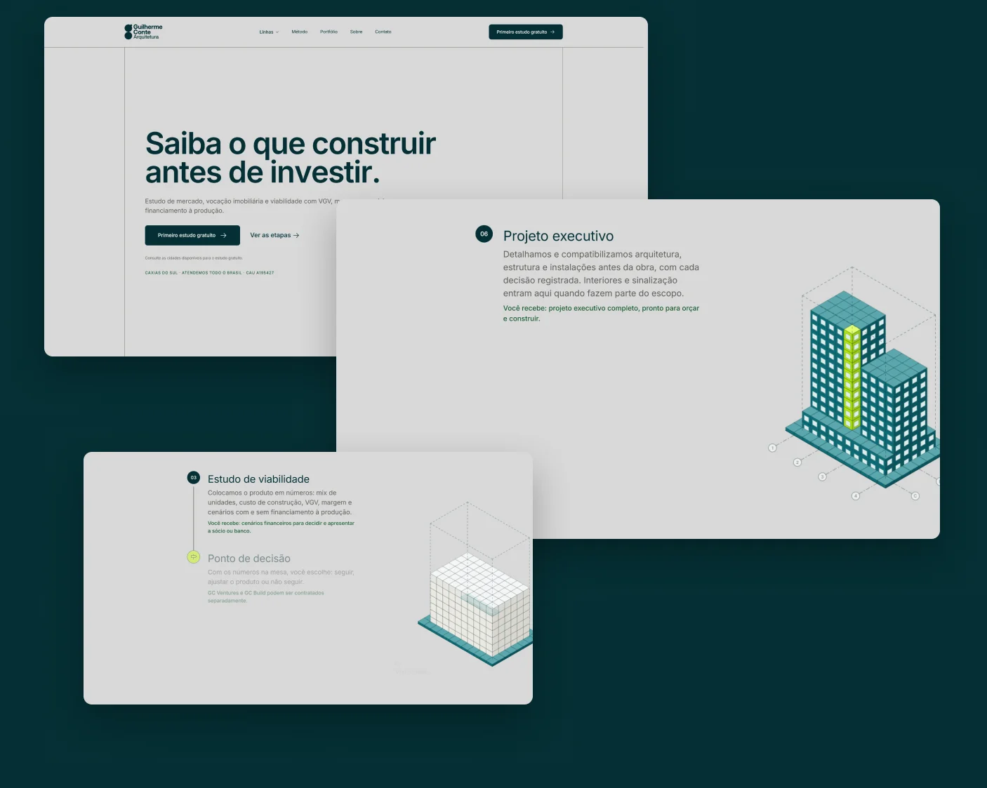
Guilherme Conte Arquitetura repositioned itself for small developers and builders. The work now runs in three lines: GC Ventures for market, vocation and feasibility studies, GC Build for the architecture of houses, buildings, interiors and signage, and the feasibility platform Projeto Simples.
The old site showed a portfolio. The new one had to explain a method that connects the three lines, from the lot to the documentation, to an audience that thinks in numbers.
Nine stages, each one closed before the next.
Each stage had its own deliverable and a review before moving on: the research set the grid reference, the copy was approved in Figma before any layout, and later changes came in as change requests that reopened only what depended on them.
- 01 Discovery
- 02 Research
- 03 Copy
- 04 Design system
- 05 Figma
- 06 Motion
- 07 Build
- 08 QA
- 09 Delivery
Four decisions that shaped the site.
- 01
A grid you can see.
Every section sits in a framed container with visible 1 px lines, and cells touch the lines, like a technical drawing.
- 02
One method, three lines.
Sistema GC organizes the work in three squads, Descoberta, Desenvolvimento and Documentação, shared by every service.
- 03
A journey you scroll.
One diagram evolves on the same lot as the visitor scrolls, from the empty site to a building with slabs and windows.
- 04
No dead-end forms.
A three-step form qualifies the lead and opens WhatsApp with the message ready, so every request reaches a person.
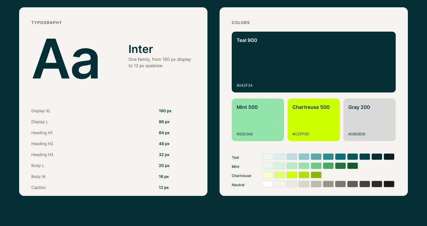
408 variables, generated straight into the code.
The tokens live in Figma and a script writes them into the site's CSS, so a change in a color or a spacing reaches every page from one place. Type and spacing scale fluidly between 1280 and 1920 px, with tablet and mobile steps at 1024 and 768.
- 408
- variables in total
- 307
- semantic tokens
- 32
- component sets
- 3
- breakpoints: desktop, tablet, mobile
One curve, one rhythm.
All motion runs on GSAP with ScrollTrigger and Lenis smooth scrolling, on a single expo.out curve. Each pattern is switched on in the markup with a data-motion attribute, hero elements enter in reading order, and everything respects prefers-reduced-motion.
Do terrenoao projeto.
P1Letter by letter
Hero titles · blur 16 → 0 · scale 0.8 → 1 · 0.6 s · 25 ms per letter
Dados para decidir,arquitetura para executar.
P2Word by word
Section titles · blur 16 → 0 · scale 0.85 → 1 · 0.5 s · 60 ms per word
Estudo de mercado, viabilidade earquitetura para pequenos incorporadorese construtores. Casas, edifícios einteriores.
P3Line by line
Body text · rises 24 px · 0.9 s · 80 ms per line
- GC VENTURES
Saiba o que construir
antes de investir.P4Eyebrow
Section labels · rises 12 px · 0.4 s
- GC VenturesGC BuildPlataforma
P5Children in sequence
Cards and lists · rise 40 px · 0.7 s · 120 ms apart
P6Image
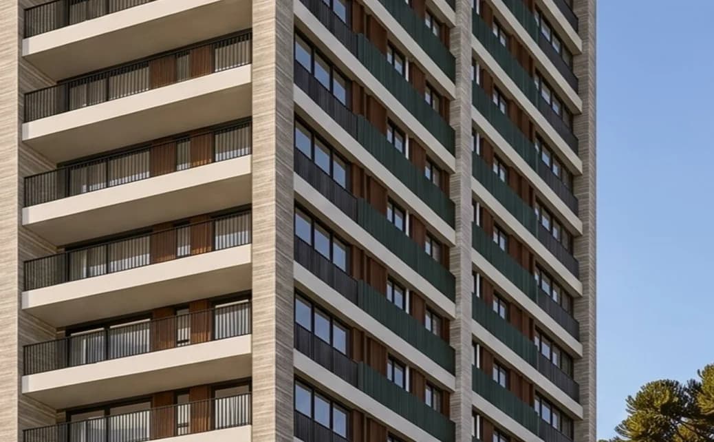
Photos · scale 1.15 → 1 with fade · 1.2 s, then ±4% parallax on scroll
- R$ 232 miem VGV estudado
P7Stats
Numbers · loading bar fills, then the digits rise · 0.9 s
- Estudo preliminarEtapa 03AnteprojetoEtapa 04
P8Journey
Pinned stage · the next step takes the place of the previous one and the diagram evolves with the scroll
- Dados do loteEstudo de massaIndicadores financeiros
P10Sticky stack
Feature panels · each one sticks below the header and the next covers it completely
- Primeiro estudo gratuitoPrimeiro estudo gratuito
HoverButton push
The new fill comes down from the top and pushes the label · 0.5 s
- Ver o método
HoverLink
The underline grows from the left · 0.4 s
prefers-reduced-motion:
reduceA11yReduced motion
With prefers-reduced-motion on, every element appears in its final state, and smooth scrolling is turned off
Same names in Figma and in the code.
32 component sets, from buttons and tags to the journey step, the project card and the three-step lead form.
- Button
Button
Push hover: the new fill comes down from the top.
- Button
Button · hover
The hover state, as it lands.
- Saiba mais
ButtonLink
The underline grows from the left.
- Arquitetura
Tag
Eyebrows and labels, 4 px radius.
- R$ 232 miem VGV estudado
Stat
Numbers that summarize the practice.
- 01TerrenoO que a legislação permite construir no lote.Você recebe: potencial construtivo e estudo de massa do lote.
JourneyStep
One step of the journey, five states.
- GC BuildArquitetura para casas, edifícios e interioresDo estudo preliminar ao executivo, com disciplinas compatibilizadas antes da obra e cada decisão registrada pelo Sistema GC.CasasEdifíciosInterioresSinalizaçãoConhecer o GC Build
ServiceCard
Each line of work, as a card or a cell.
- Vocês são uma incorporadora?Não. A gente estuda e projeta. A decisão e o empreendimento são seus.
AccordionItem
Questions that open on demand.
- Nome completoGuilherme ConteComo podemos te chamar.
FormField
Inputs, selects and text areas.
- Construtor ou incorporadorQuero avaliar um terreno para construir.
ChoiceCard
Choices in the three-step form.
- Em projetoResidencial MontereyResidencial multifamiliar · Caxias do Sul · 2026
ProjectCard
Portfolio cards with zoom on hover.
- Squad 01DescobertaBriefing, estratégia e levantamentos antes de qualquer desenho.BriefingEstratégiaLevantamentosPrograma
MethodCard
The Sistema GC, one card per squad.
Home
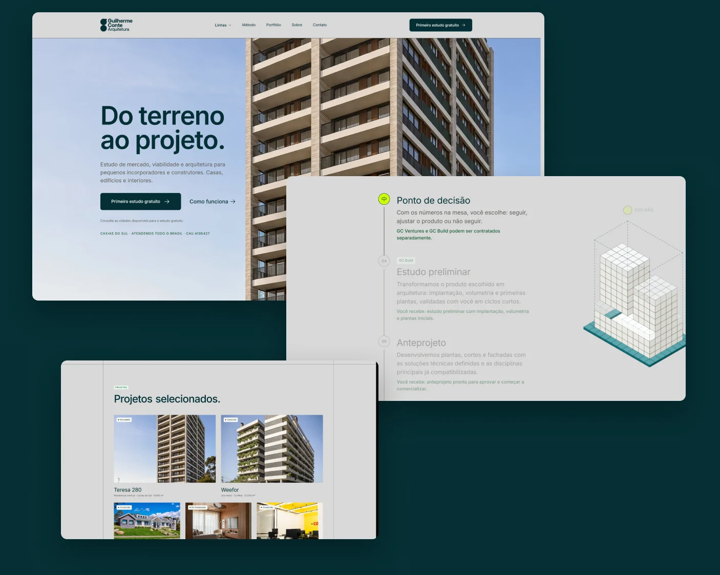
The home presents the three lines, the journey from the lot to the project, the method, selected projects and the questions developers ask first.
GC Ventures and GC Build
Each line has its own page with the same structure: what it delivers, the journey on the same lot, the steps and a direct call to the first study.
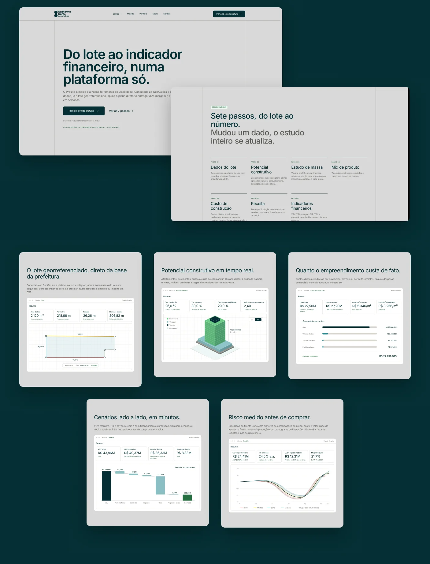
Plataforma
The platform page shows each feature with a fixed navigation on the side and animated mockups that redraw real screens of the app.
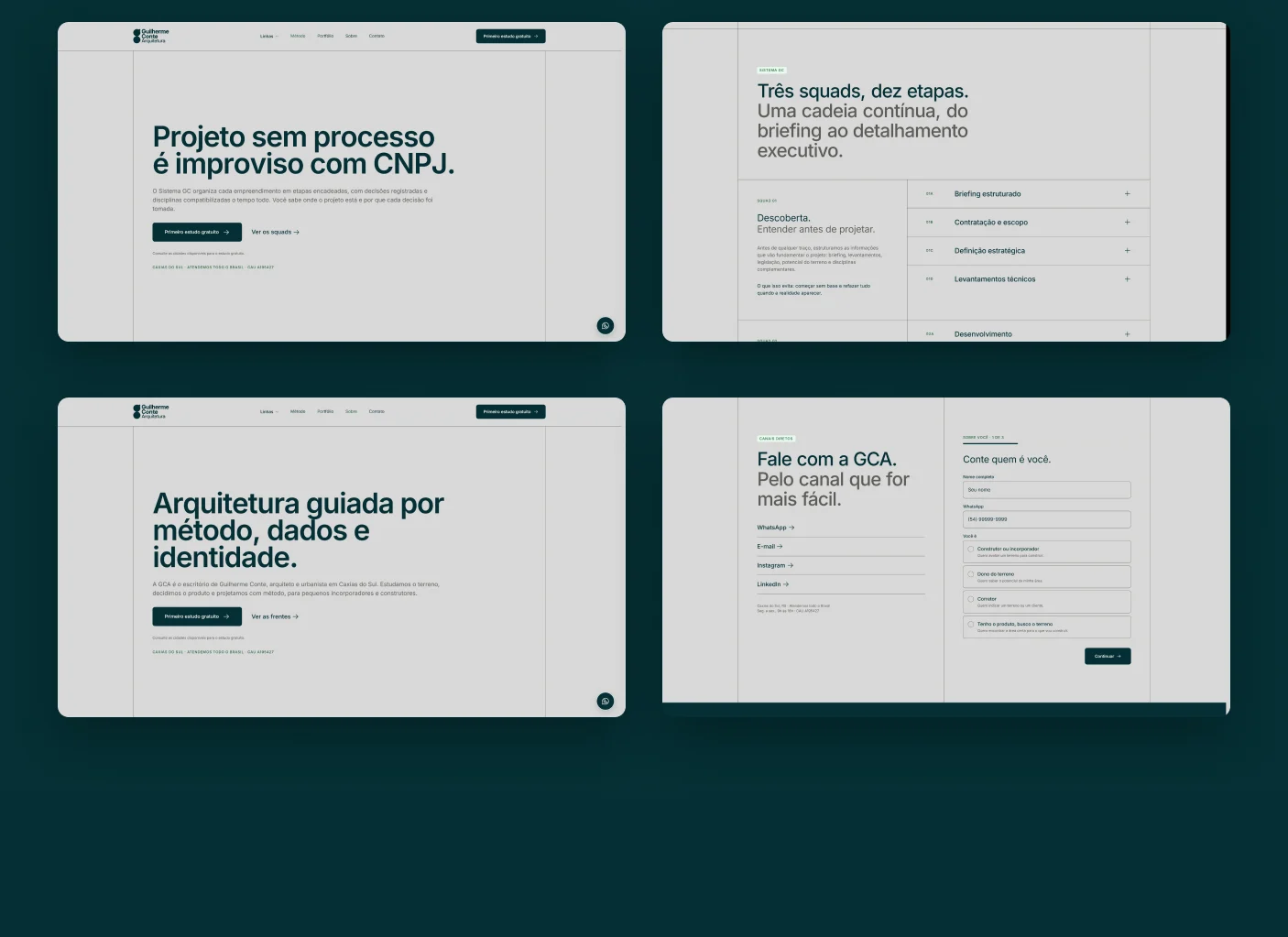
The other pages
The method explains the three squads step by step, the portfolio filters projects by typology, and contact runs as a three-step form.
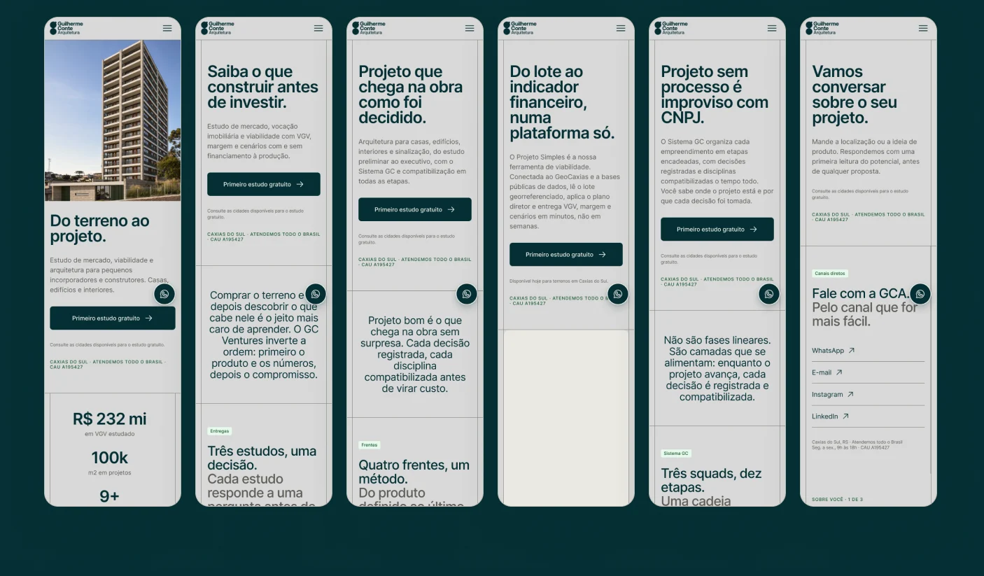
Mobile
Every page has its own mobile layout at 375 px, with the image above the text in the hero and the same components resized by the responsive tokens.
Shipping without losing what already worked.
The new site kept the Google Tag Manager container and the Search Console verification of the previous one, and every old address redirects to its new page. Privacy policy, 404, sitemap and robots were part of the build, not an afterthought.
- /galeria → /portfolio
- /processo → /metodo
- /servicos → /
- /para-quem → /
- /politica-de-privacidade → /privacidade
Thanks for reading.
- Design
- Guilherme Conte
- Front end
- Guilherme Conte, with AI assistance
- Year
- 2026