Dalcalc Website
A brand, a design system and a website for a structural engineering firm, all built on the rules of a technical drawing.
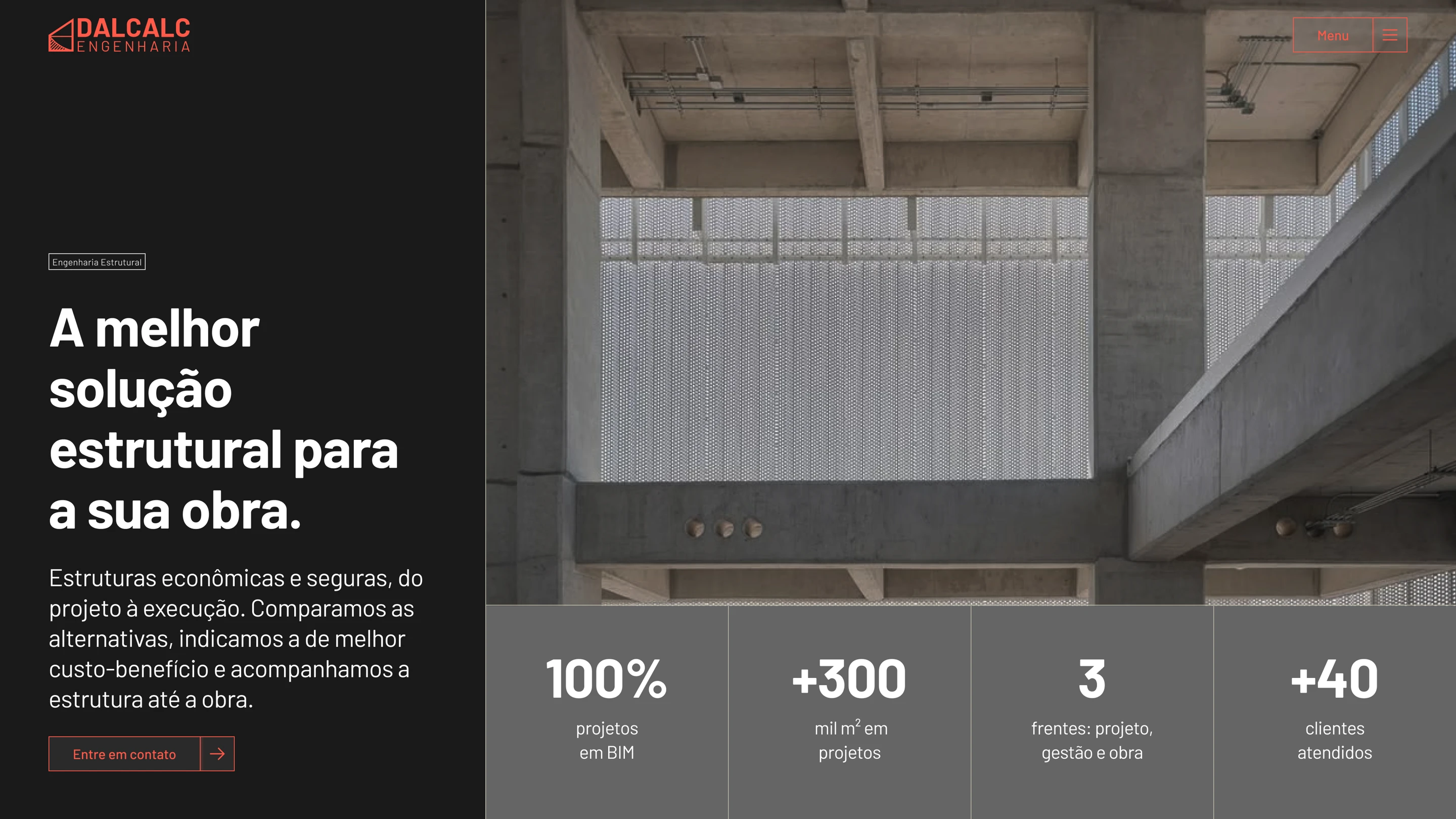
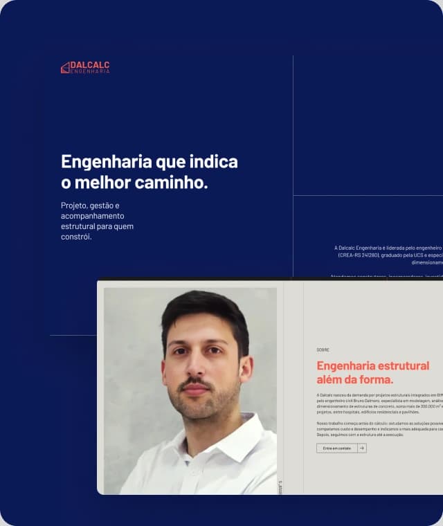
An engineering firm that needs to look like what it is.
Dalcalc works with calculation, codes and responsibility. The site had to carry that seriousness from the first screen without looking dated: rigor and a contemporary feel at the same time.
- Credibility
- Be taken seriously by developers, builders and architects from the first screen.
- Differentiation
- Step away from the usual engineering site without losing the sobriety of the sector.
- Clarity
- Make it obvious what Dalcalc does, for whom and with what experience.
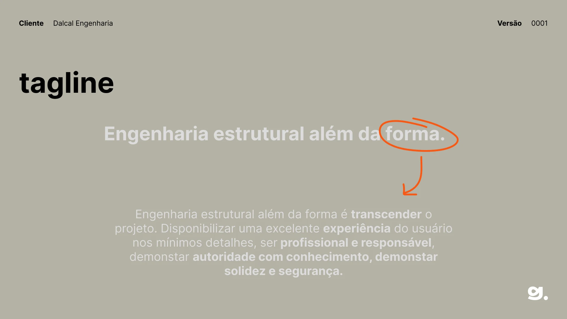
Structural engineering beyond the form.
Before the site, the brand. The branding started from the briefing and the audience, engineers, architects, builders and contractors, and set the brand on three archetypes, the Sage, the Ruler and the Creator, with a DNA of innovation, solidity, safety and authority. The tagline sums it up: go beyond the project, with knowledge, responsibility and attention to detail.
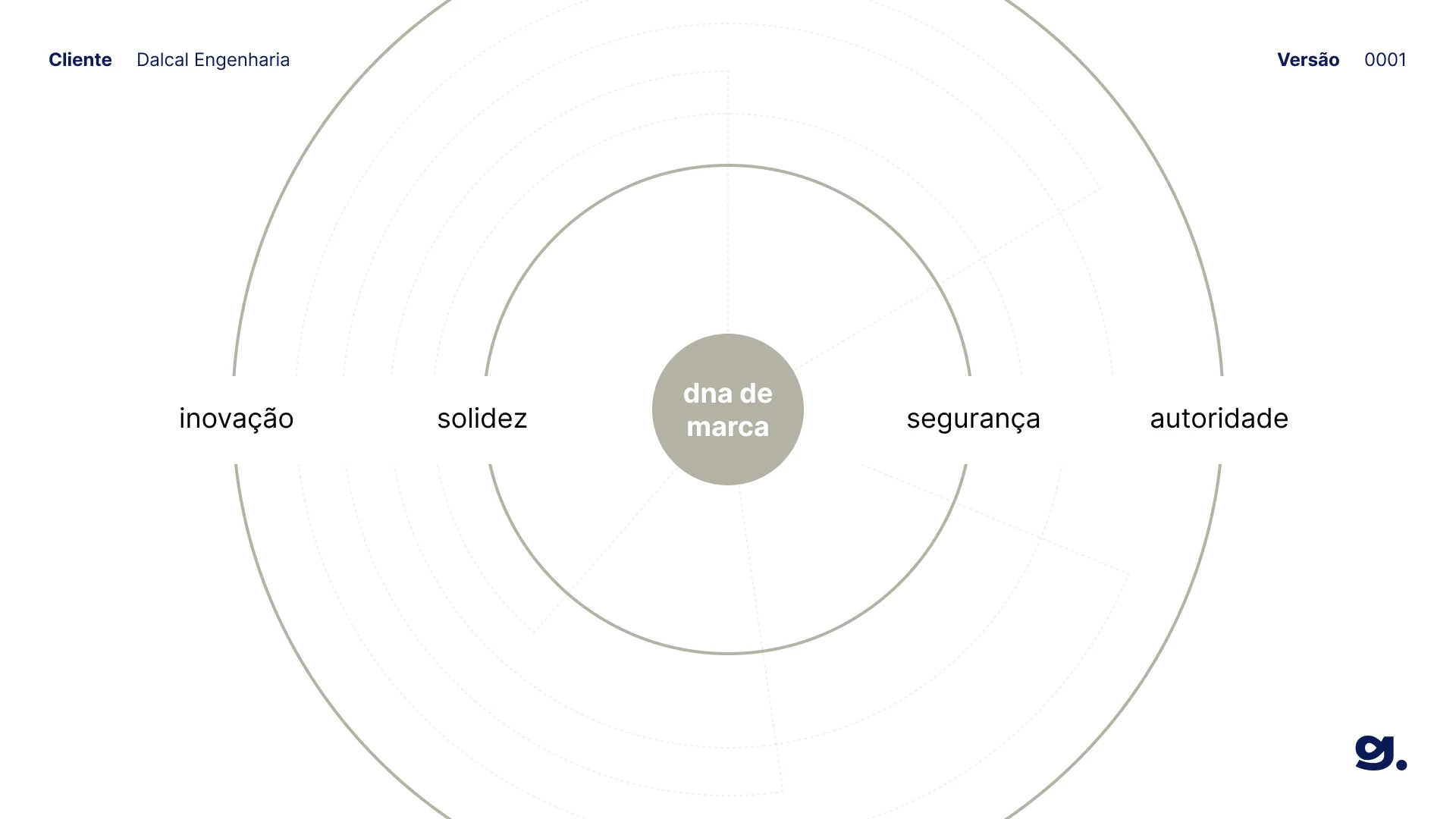
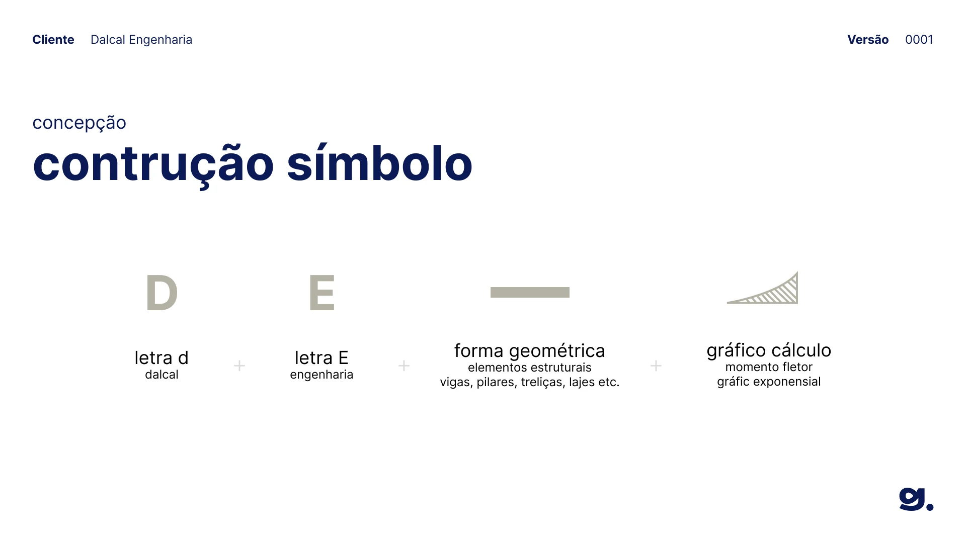
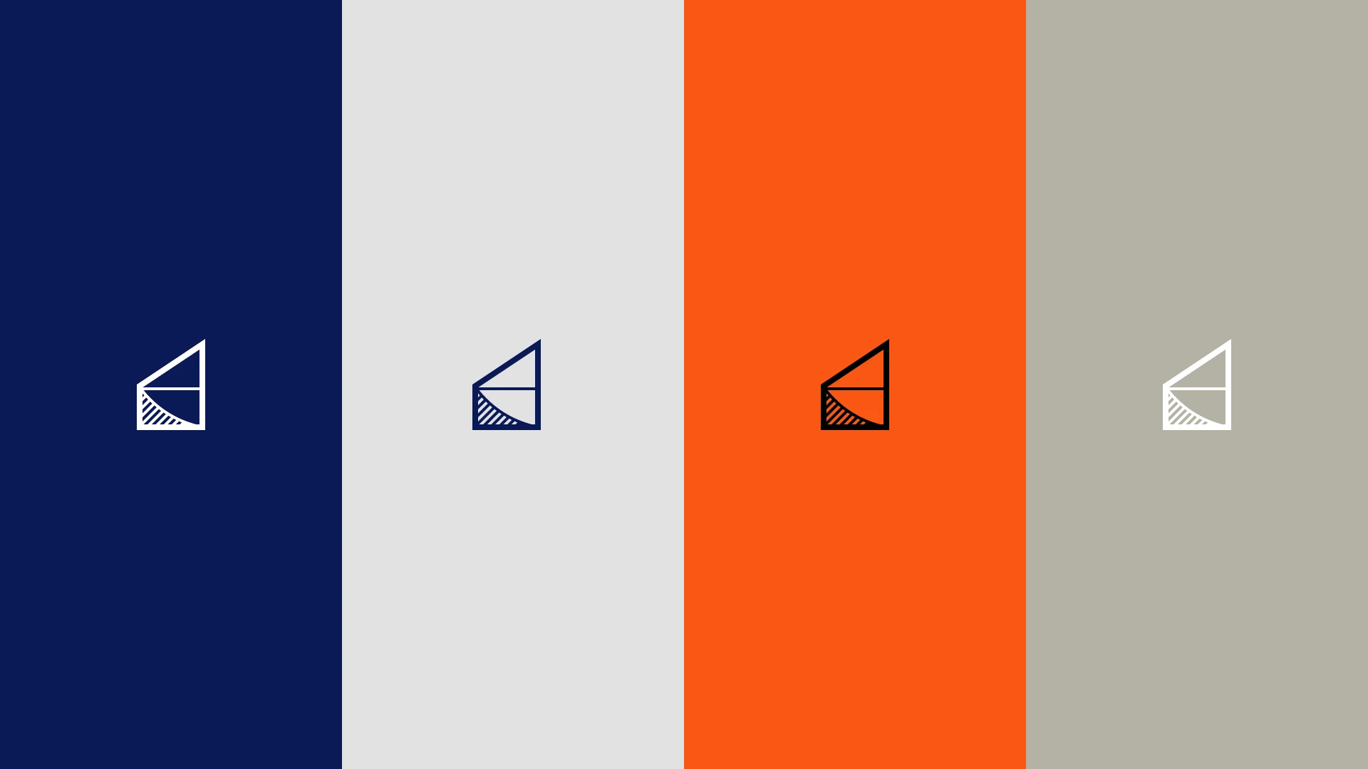
A symbol drawn like a structural diagram.
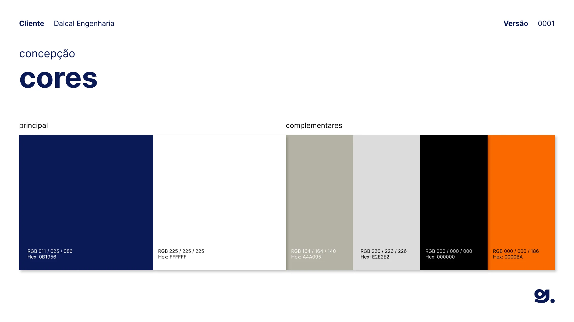
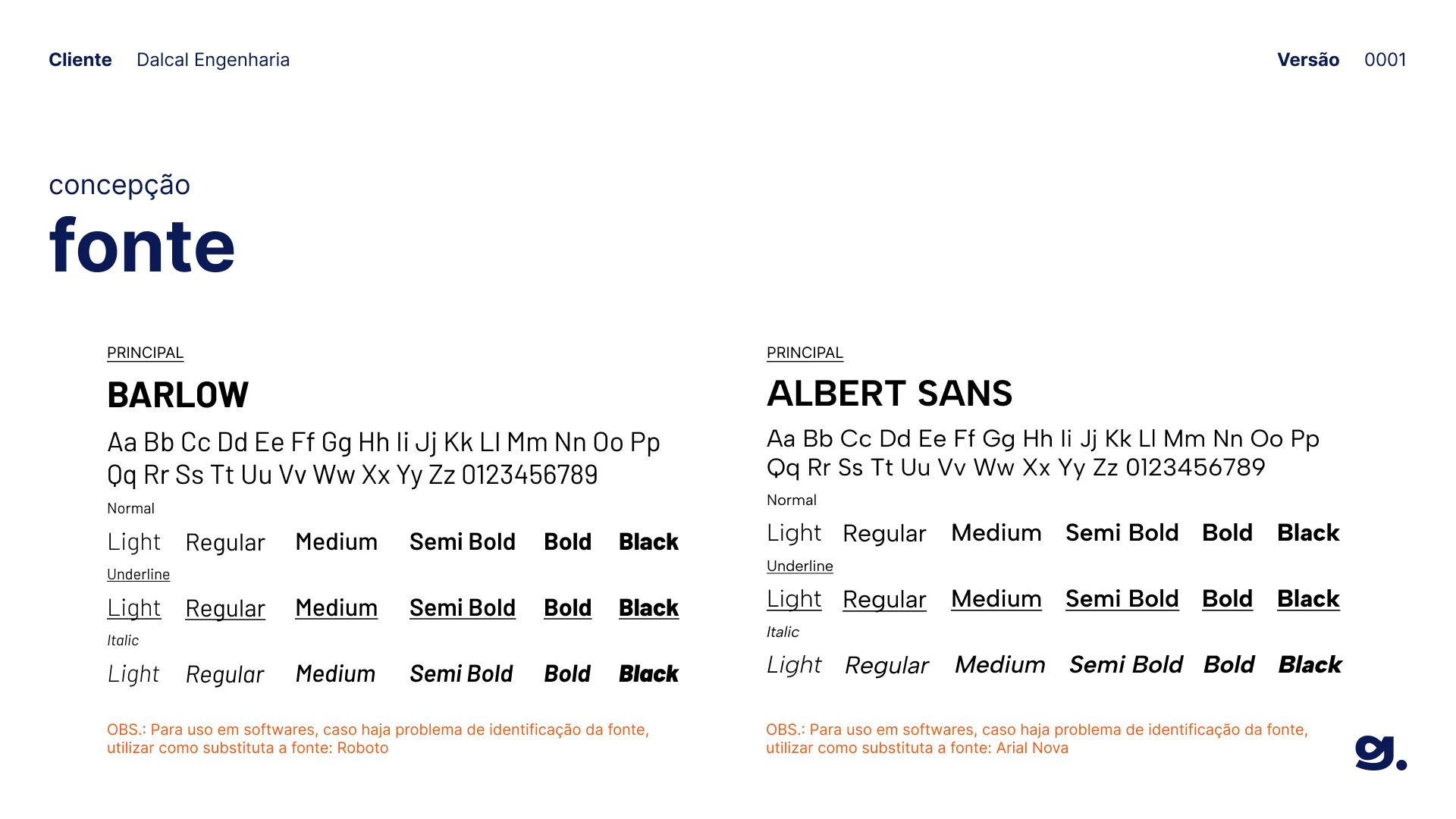
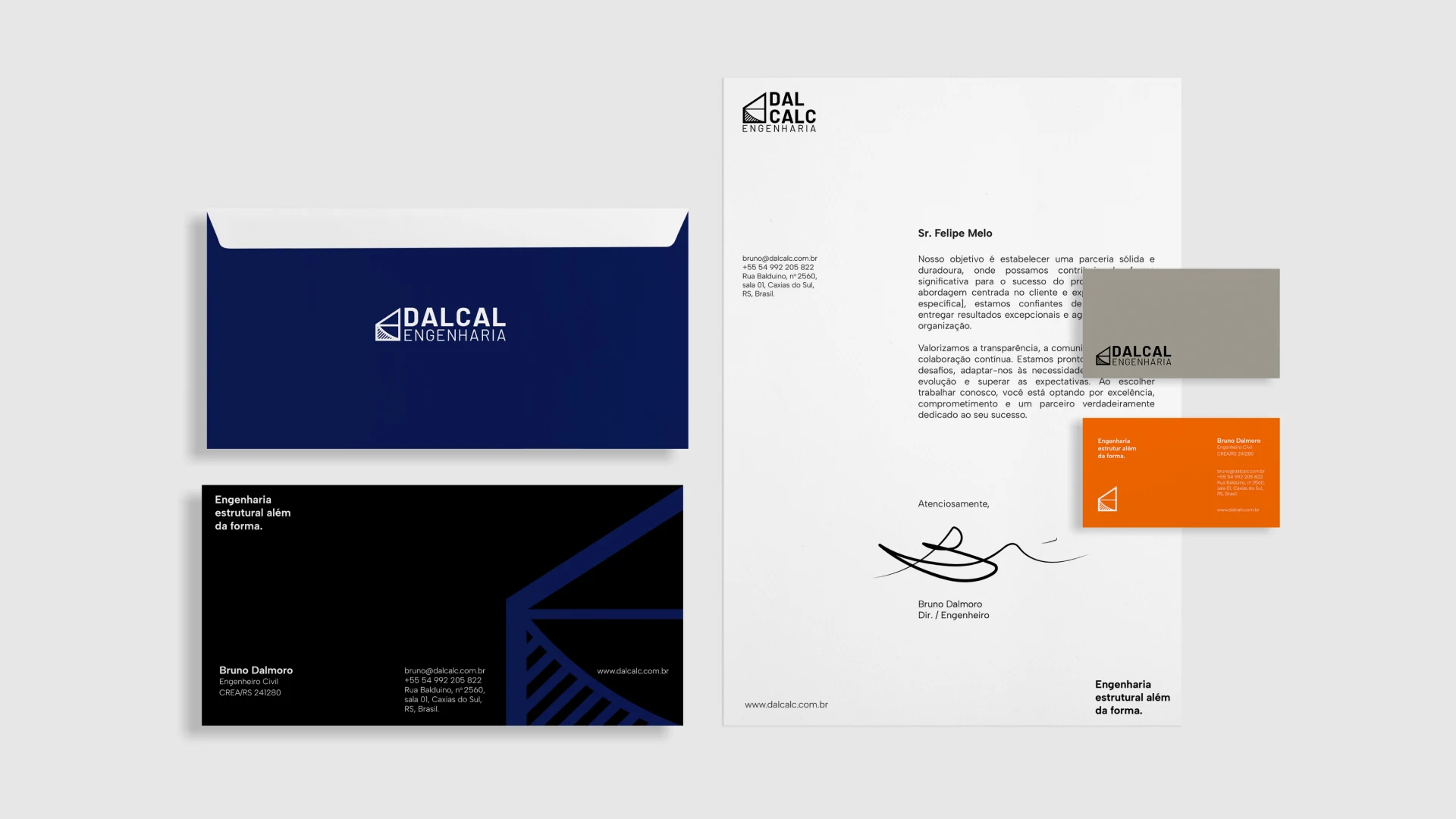
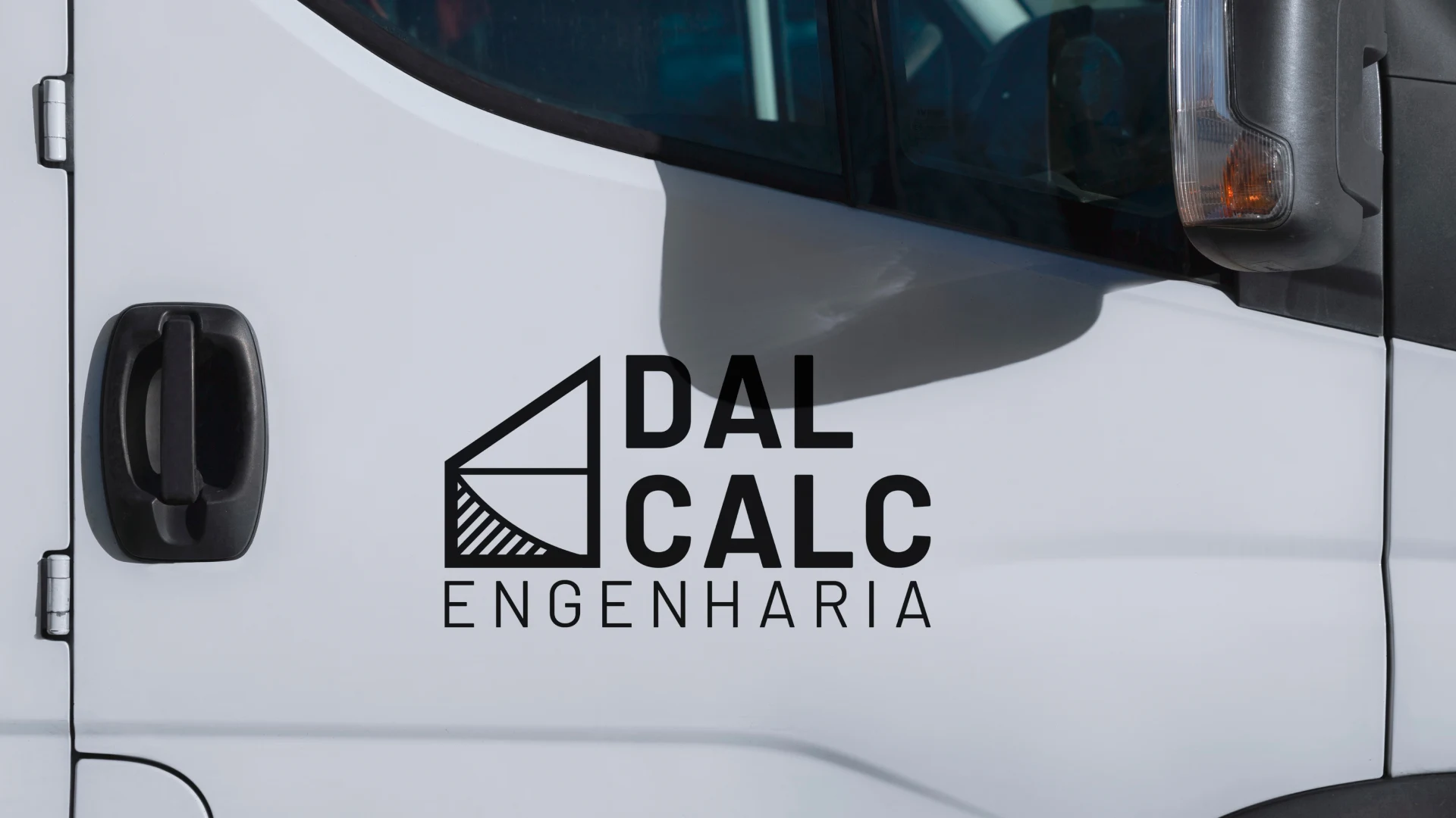
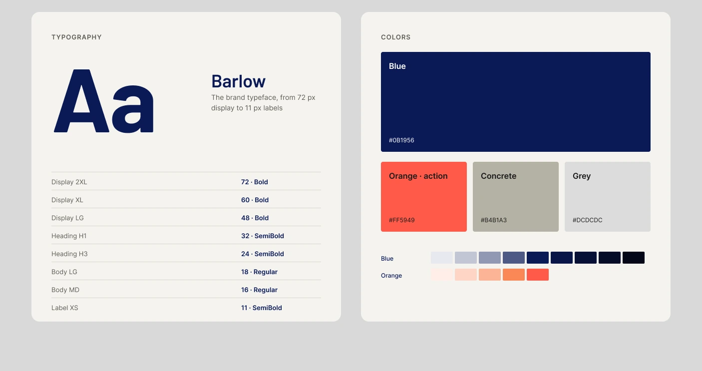
The symbol joins the D of Dalcalc and the E of Engenharia with a geometric form of structural elements, beams, columns, trusses and slabs, and the curve of a bending moment graph. Barlow sets the titles and Albert Sans the text, on a palette of deep blue, concrete, grey, black and white.
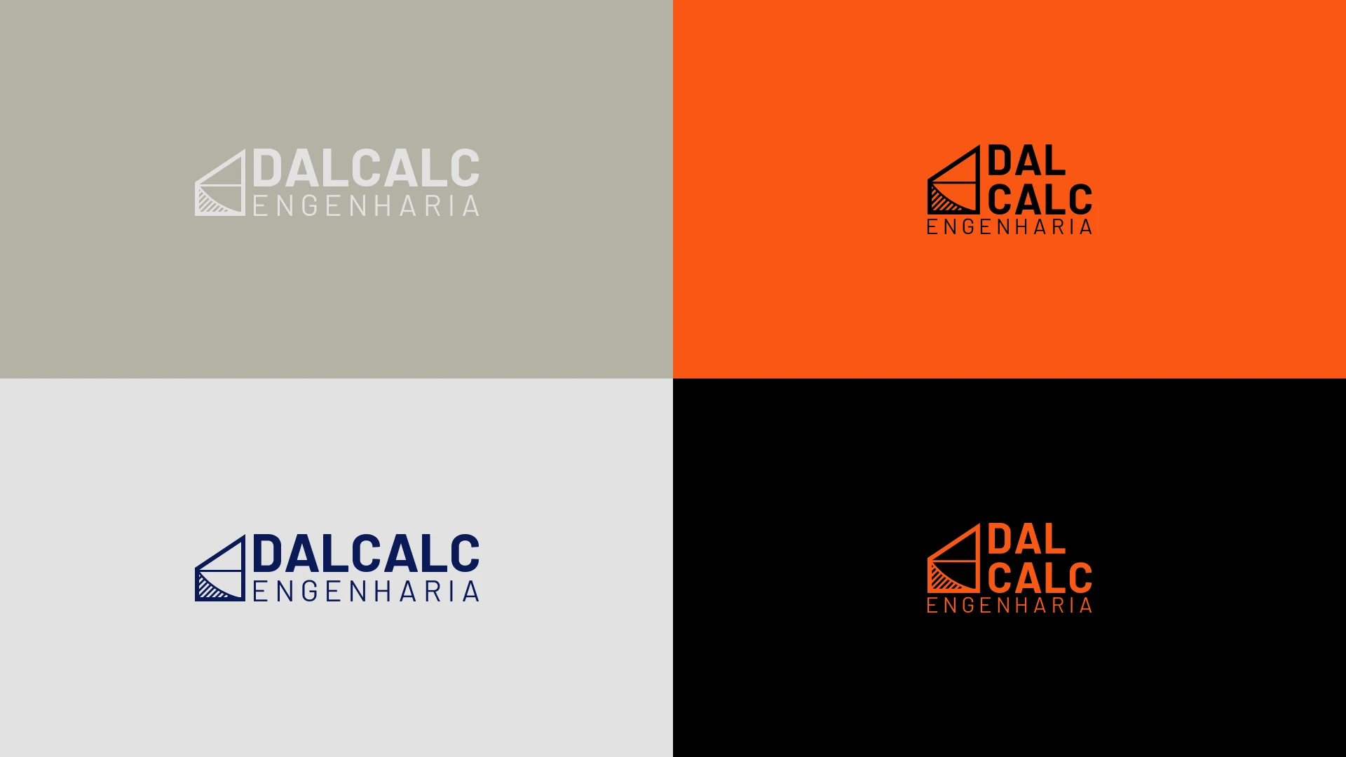
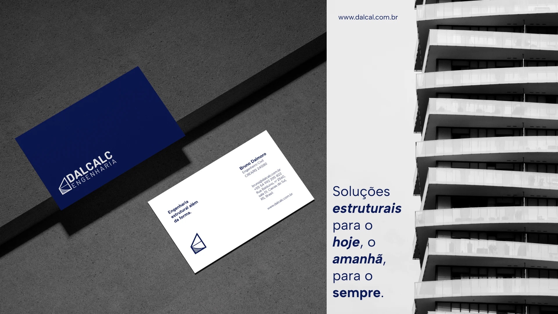
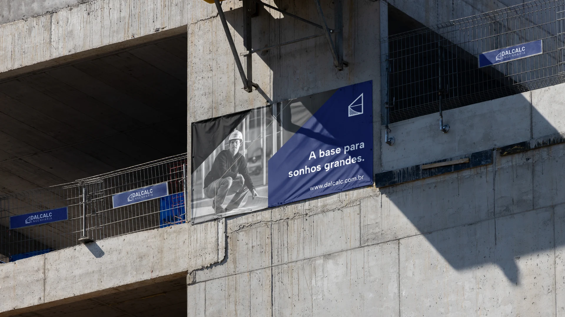
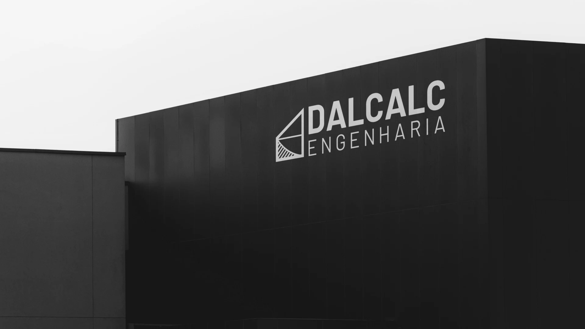
From the business card to the facade.
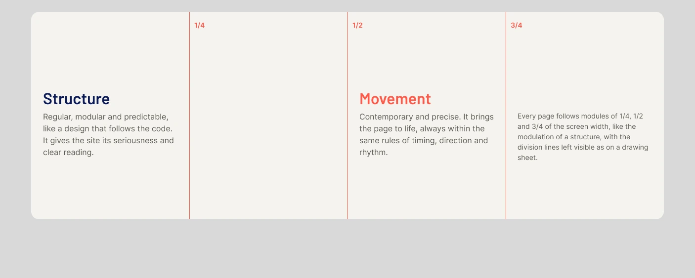
Structure and movement.
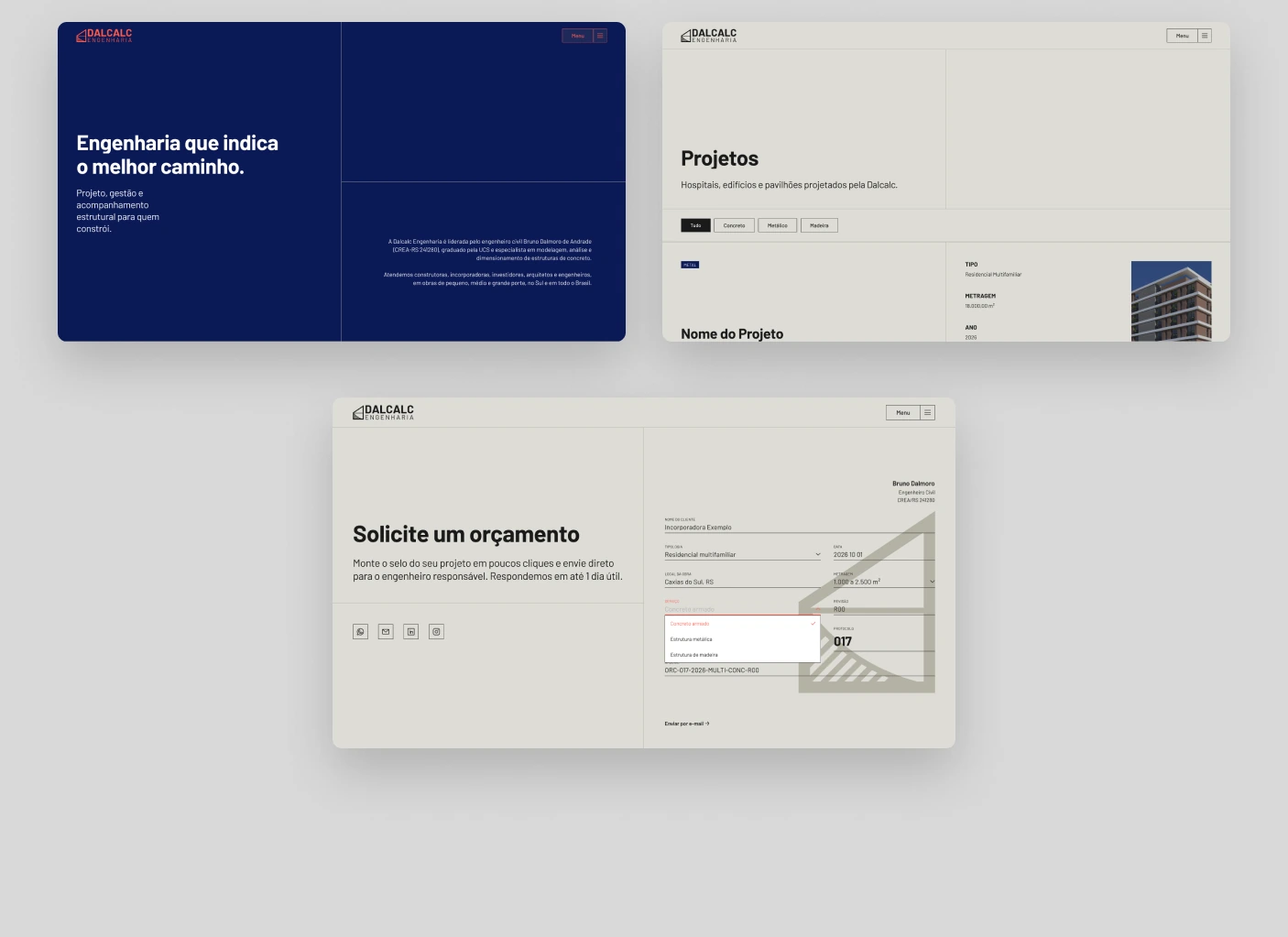
The layout is treated as structure, and movement is what makes that structure feel current, without ever breaking the rule. Every page follows modules of 1/4, 1/2 and 3/4 of the screen width, with the division lines left visible.
Four decisions that shaped the site.
- 01
A grid like a structure.
Quarters, halves and three quarters of the screen, with visible division lines, as on a technical drawing.
- 02
Text that reads like a sheet.
Firm titles in Barlow, the brand typeface, and short uppercase labels numbered like drawing captions.
- 03
Material, not ornament.
A palette of concrete, steel and black with black-and-white photos. Orange appears only where there is an action.
- 04
The stamp as contact.
Instead of a form, the client fills in the stamp of their project and sends it to the engineer on WhatsApp.
286 variables, from color to the timing of every motion.
Color, spacing, radius, layout, typography and motion are all variables. Thirty component sets carry 1,630 variants, most of them the steps of an animation, so the prototype moves exactly as the site will.
- 286
- variables in six collections
- 30
- component sets
- 1,630
- variants, most of them animation steps
- 18
- motion tokens
Contemporary, but with a rule.
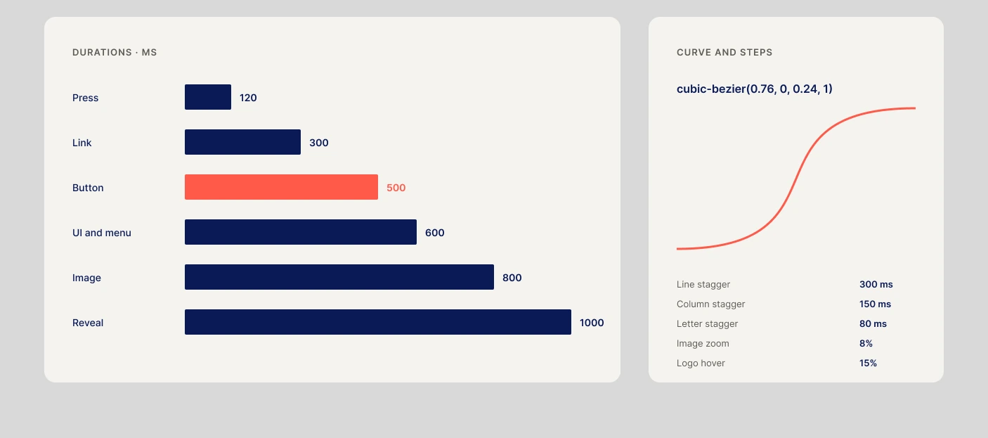
Every movement uses the same curve: it starts contained, accelerates and settles firmly. Timings are fixed by type of element, and a new state pushes the previous one out instead of overlapping it, like a load passed from one piece to the next.
A new state pushes the previous one out.
Links in 300 ms, buttons in 500 ms, titles and menu in 600 ms, images in 800 ms. Reveals happen through cuts, lines and axes, the language of a technical drawing.
- Solicite um orçamentoSolicite um orçamento
07 /Button push
Hover enters from the top and pushes the default state out, without overlap · 500 ms
- →→
07 /Icon push
Icon-only buttons push sideways and enter in orange · 500 ms
- Saiba mais→
08 /Button link
Underline and orange on hover, the arrow steps 4 px toward the destination · 300 ms
A melhor soluçãoestrutural paraa sua obra.
10 /Title reveal
A band crosses each line from left to right and leaves the text behind, lines 300 ms apart
- 01 /PROJETO ESTRUTURAL
11 /Eyebrow scramble
Labels shuffle their letters until the word forms, like a calculation reaching its result · 50 ms per step
- +mil m² em projetos · número de protótipo
11 /Stat counter
Highlight numbers count up from zero and slow down at the end
- Sobre+A Dalcalc nasceu da demanda por projetos estruturais integrados em BIM.Para quemServiços
13 /Index item
Items open on demand: the + turns 45° into ×, and the items below are pushed down
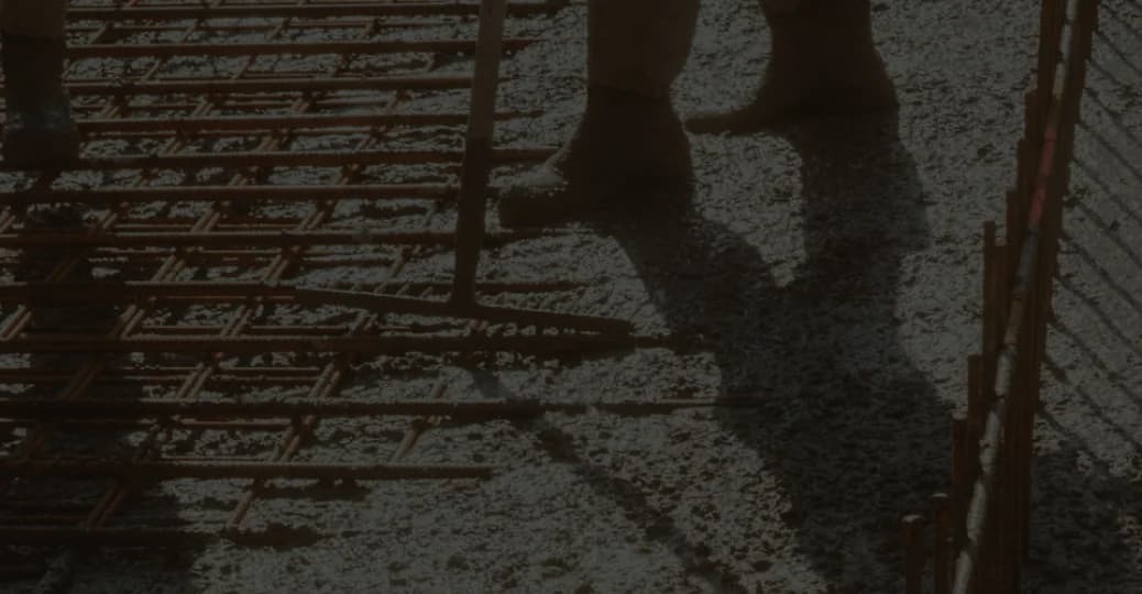
14 /Image zoom
Photos zoom 8% from the center inside their own frame; text over them stays still · 800 ms
 29°10′S 51°11′W
16 /Crosshair reveal
The image opens from a corner, pulled by two axes that cross the section, with coordinates counting to the office
- DALCALCMenu ≡×SobrePara quemServiçosProjetosContato
09 /Menu overlay
The menu slides in from the right and keeps the page visible behind it · 600 ms
- 01 /PROJETO ESTRUTURALProjeto Estrutural
em BIMEstudamos as alternativas e indicamos a estrutura de melhor custo-benefício.12 /Services in sequence
The grid line draws first, then the number, the label, the title and the content settle
- LOCALIZAÇÃONAVEGAÇÃOCONTATODALCALC
19 /Footer signature
Columns appear in cascade and the DALCALC mark rises letter by letter
Built around the motion.
30 component sets: buttons that push their states, links with a 4 px step, titles revealed by a band, counters, index items, material images and the fields of the project stamp.
- Button
Button
Four styles, from the strongest to the most discreet, with push hover.
- Saiba mais
ButtonLink
Low-commitment actions; the arrow steps 4 px forward on hover.
- LABEL
Eyebrow
Short uppercase labels that scramble into place.
- CONCRETO
Badge
Status and category, in the brand palette.
- A melhor solução estrutural
TitleReveal
Each title line revealed by a crossing band.
- 10Anos de atuação
StatCard
Highlight numbers that count up from zero.
- Sobre×01 /A Dalcalc nasceu da demanda por projetos estruturais integrados em BIM.02 /Estudamos as alternativas e indicamos a estrutura de melhor custo-benefício.
IndexItem
Long content that opens on demand and pushes the list.
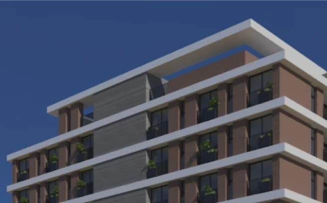 Nome do Projeto
ProjectCard
Project showcase with zoom on hover.
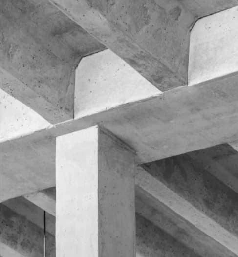
MaterialImage
Black-and-white photos of each material.
- LOGO
PartnerLogo
Partner logos that grow 15% and turn white.
- CLIENTESelecione
StampField
A field of the project stamp, filled.
- SERVIÇOConcreto armado
StampSelect
Service, typology and area lists that open on click.
Home
The home opens with the promise, presents the services in sequence, the team with a crosshair reveal, selected projects and a footer signed by the brand in large scale.
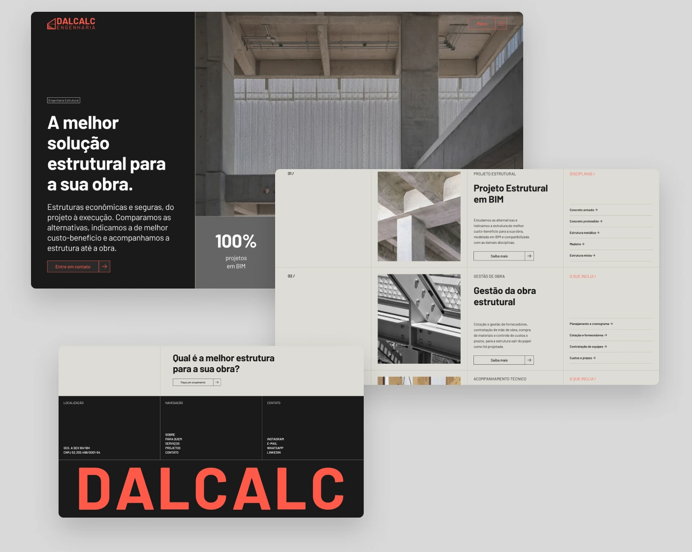
Services
Each structural system has its own page: concrete, steel, timber, post-tensioned concrete and composite structures, plus site management and technical supervision.
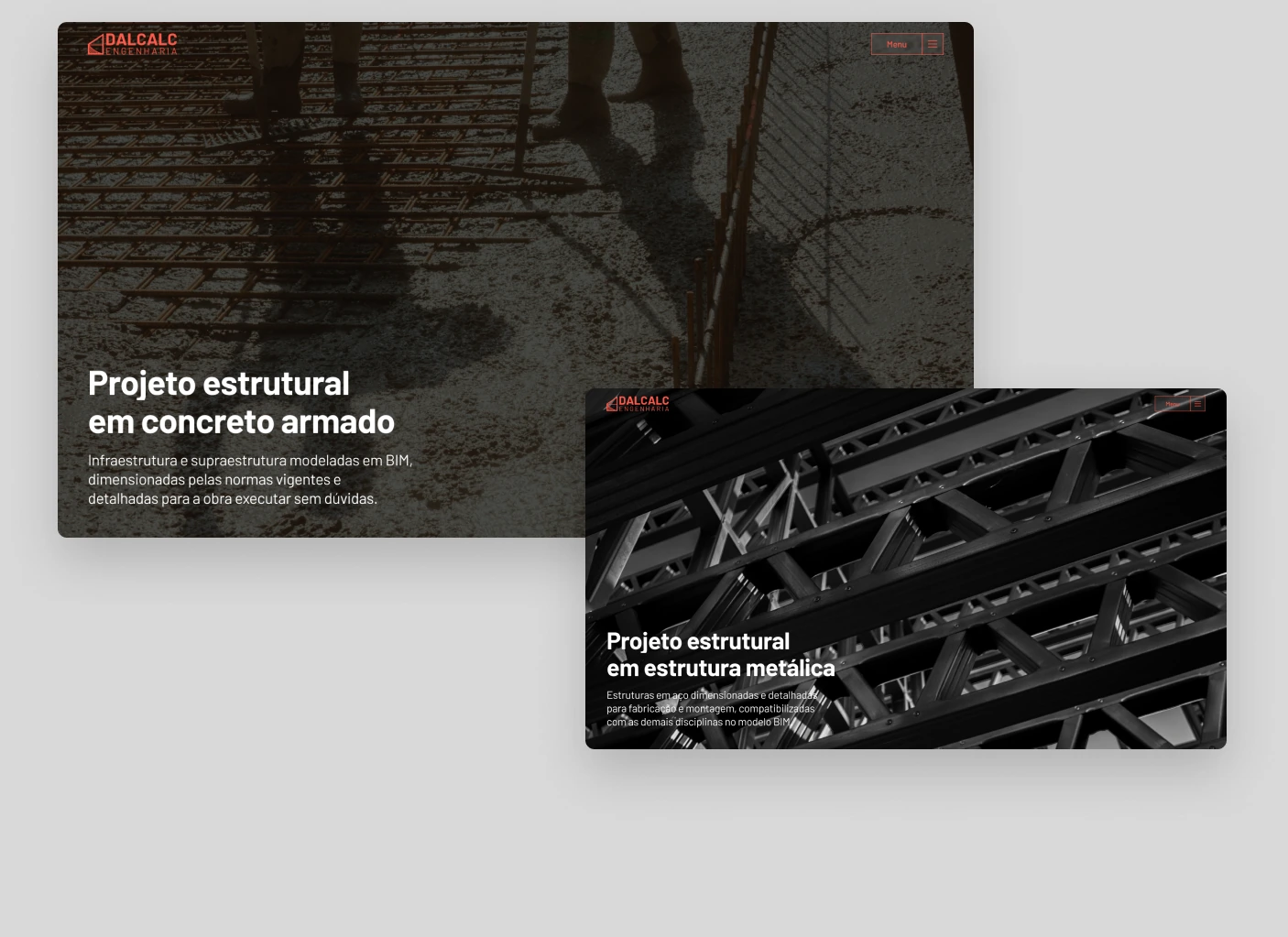
The other pages
About presents the engineer in charge and the firm, projects can be filtered by structural system, and contact is the project stamp.
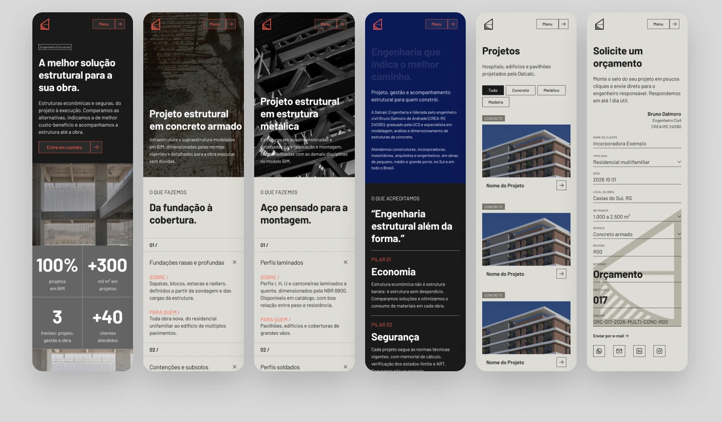
Mobile
Every page has its own mobile layout at 390 px, keeping the grid lines, the numbered labels and the same motion rules.
From prototype to site.
The texts, numbers and photos of this prototype are provisional. The site is built in Next.js on the same design system and motion rules, and the final content comes from the client's briefing before it goes live.
- 1 · Briefing
- 2 · Content
- 3 · Implementation
- 4 · Publication
Thanks for reading.
- Concept, UI and motion
- Guilherme Conte
- Client
- Dalcalc Engenharia
- Year
- 2026